Last week, Rades explained the process of how he scripts and sometimes storyboards a FDWL script! This week I’m going to be telling you about how I do the sketching and art.
For a larger version of today’s strip, click here!
The following is a transcript of text from the above image.
It’s worth noting that over the time we’ve been doing this I have simplified the art a fair bit to save time. This strip was back when I was doing more elaborate art; we weren’t doing storyboarding at the time either so I would basically sketch it out and then show it to Rades.
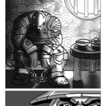
This is the very first sketch. You’ll notice that the Dragonwrath in the last panel moved around a bit. This was because I was confused about the script. Rades had described it as “leaning” and I thought he meant propped against the wall or otherwise just leaning there. As you can see in the final art though, he actually meant LEANING in to look at Millya in the doorframe.
In the second iteration of the art I have started the line work for the panels where there won’t be any changes. I also finished the Dragonwrath altogether because no changes were needed for it at all. You can see how it’s over top of Millya’s hands, I needed it to be complete so that I could just copy/paste and rotate it for the other panels. This kind of thing saves a lot of time instead of drawing and painting it four times. The other thing that changed was Millya’s expression in panel 2. I’ll often paint the background before I do anything else because it’s best to paint on top of a colour rather than on top of white. I use Photoshop exclusively for painting the comic. I’m especially proud of the opacity effect in P2 that shows Millya’s invisibility being broken. This was made even more pronounced in the final version to really show just how invisible she was.
The Trigger Finger strip is a good example of some changes in the sketch phase. In the first iteration we didn’t like Millya’s hand gestures. We also made the pyroblast quite a bit bigger to really emphasize it. I sketched in the configuration of the word bubbles to get some idea of how much room I had. You’ll also notice I was wrong about how Horridon looks – I was just using a generic dinosaur model initially.
Here you can see I even did the linework for the “wrong” dinosaur, it was only after that I found an actual image of him and realized he looks completely different. Also, his eyes are covered! Vosskah’s facial expression changed from one panel to the next here, too. Rades thought he should look more horrified than stoic. I usually work over top of one random flat colour while I’m doing the sketching. It’s usually teal. No special reason, it’s just the colour I picked. Then I change the panels to the actual background colour.
When the art is finished, I show it to Rades one last time! You can see I’m a bit sloppy when it comes to panel borders, and sometimes I will draw/paint something in its entirety even if it isn’t shown, so that Rades can move it around if he needs to. This is what the strip looks like when I am done with it. I send it to Rades to add the text, white panel borders, and any other fancy things he wants to do. I am fortunate that he is a designer and InDesign pro so he is better at that stuff than I am.
This is the last I see of the strip until it’s published, I actually see it for the first time in its finished form usually at the same time that it goes live!

The art process is always so fascinating 😀 bonus points for sketching over teal because everyone knows teal-y colours are the best ones!
It’s great reading the process behind the comic! Thanks Vid 🙂